

A Crossover in the Archive Era

It took a while for the Allied Coastline (AC) to grow on me. At first contact is seemed strange. I was mostly interested in 38mm and 40mm Timex lines and the Coastline was 43mm and I was having trouble seeing where it fit in with the Mk1s, Allieds and Navis I was collecting. They had a field watch-style dial and a diver-style bezel? The 38mm Navi series did the same, but for some reason they seemed more appropriate? I think the AC struck many as strange. Maybe it was that some had more modern styling? As I consider them now, I like what I see.
In a way, the name makes sense; a field watch that’s not quite in the water. They kept catching my eye. They seemed similar to other Timex lines, but there was something different about them from anything Timex had going at the time. They were a standout for what they were not, rather than what they were. Not a diver, not a field watch, not like other Allied, not an Expedition, not a Harborside?

There are also several subgroups that each have distinctive features. This also muddles the categorization for me. Timex likes to expand a line with lots of looks to cover a wide range of customer niches. Some are more field-ish, some definitely more diver-ish, some more dressy. I’ll attempt the break them down so you can see the differences.
These watches make me consider what determines a watch’s category. Is it the bezel, the dial, the case finish, the strap, the WR? If you mix up these design cues, does the category change? It also makes me consider the difference between a style and a function. Timex has a long history of diver style watches that have a 50 or 100m WR. Are these really divers, or diver style watches. You could ask the same of many of their field style watches. Are they really field watches?
Some Specs
They are all 43mm x 51mm lug-to-lug. The lugs are fairly long. All are quartz with date and Indiglo backlighting. They all have a snap-on stainless steel back and a unidirectional , 60-click, diver count up bezel. (This was different than the Navis, which had friction-fit bezels, not ratchet bezels.) All use the M905 movement. Most have a unique skeleton style hand set with a bold arrow for the minutes and a blunt flat end for the hours. This hand set will be used again on the Waterbury Dive 41mm. The crystals are flat of mineral. They all have 100m water resistance (WR). For the “field” styles with a 24hr track, the second sweep is like that on the Expedition Scouts. For the diver style versions, the second sweep is a lumed dot style. There is a pair of Allied Coastline models that have a different hand set style that I will cover later. For the “field” versions, there is only lume on the hands, not the dials, so the backlighting is your friend. The “divers” also have lumed hour markers that initially was weak, but improved with the latest release.

Styled with Verve
To me they stand alone among the Archive lines because of their more emphatic design. They are a bit bigger, use brighter colors, have the unique hands and mix both field watch and diver cues. The bezels are prominent. They also sport some straps not found in other lines. Because I see fewer of them, I am guessing they were not as popular as the Mk1, Navi and Allied lines? Part of the problem may be that the cross over from diver to field watch confuses potential buyers?
Trying to figure out Timex can be exasperating. Styles and lines just seem to pop up out of nowhere and the disappear just as fast. Obviously, Timex watches the trends and offers look-a-like styles to cover whatever seems to be the hottest things in the enthusiast arena. Right now it seems to be vintage-inspired chronographs? I’m not sure what inspired the Allied Coastline series?

At the same time, Timex continues long-established lines like Easy Reader, Ironman, and Expedition with continuous updates. They sprinkle in collaborations and higher-end specialties. Another strong lineup is the reissue releases that have been popular for several years. But the thing is, they tend to use similar themes in more than one line. For example the vintage chronograph look can be found in the Q, the Waterbury and Standard lines, among others. Currently, Timex is revamping the Weekender again! The Weekender has become the gender-neutral generic, go anywhere do anything platform for Timex, kind of like the Q became.
Diver Emphasis
Correct me if I’m wrong, but the Allied Coastline came to be, along with other Archive lines, during the Vintage Military trend wave. This was also when Timex was weak in the non-military diver market. As we all know the diver has become a mainstay in the enthusiast arena in the past 15-20 years. Because of the costs involved in competing in the tool watch arena, Timex has had to remain on the outside if they wanted to keep the prices down. Timex did release some diver-style Waterburys with 100m WR over the last few years, but they seem a bit odd to me? Maybe its that they are new, modern designs rather than retro? Maybe its that they are more dressy? Post Archive, Timex was trying to move away from the vintage/military and show they could deliver fresh concepts. However, 200m WR, good lume, and sapphire cost money. Recently they have re-entered the tool segment with the Deepwater Reef line.
The diver segment for Timex in the Archive era was filled with Navi and Allied lines which meant 50-100m WR, mineral crystals and weak or negligible lume. I have loved and written about these watches such as the Navi Harbor, Depth, Ocean. I feel the Allied Coastline was an attempt to combine military style with diver style. The Navi XL at 41mm with its 24hr track was already there? Why the Allied Coastline? I think Timex wanted a bigger (43mm) watch to offer with clear diver styling, but mostly retaining the field watch dial. Of the 15 styles I have identified, 9 have the field watch dial with Arabic numbers for the hours, and six have a diver style dial without numbers. Why did the line morph into a more modern sporty diver?
2017-2020 (and later)
From what I know the Allied Coastline watches were released in three or four groupings over four years, from 2017 to 2020. This was prime Archive era time when Timex was capitalizing on the earlier success of J. Crew military/vintage/diver collaborations. The MK1, Allied, and Navi lines all furthered this trend. Remember, too, being pre-Covid, these were intended for the Timex boutique customer. These would not have been available in the mass market retail spaces where you would find the Expedition Scout, Easy Reader, basic Weekender and Ironman lines. Covid put an end to any Timex Boutique stores, that I know of, so online seems to be the only way to get them retail.
Having determined 2017 to 2020 as the AC time period, I have to say I have recently purchased two with date codes for 2023? They also have different case backs from my older examples. So, what does that tell us? Is Timex using up left over parts, refurbishing stock that never moved, continuing a line or doing a test run?
Phases of Allied Coast

The first to be released in 2017, from my research findings, were the leather-strapped ones. These are probably some of the more subdued looking ones. It is curious that leather(non quick release) was chosen for these diver-inspired watches with 100m WR? Maybe at this point the emphasis was more field than diver, and the vibe was wear-to-office and casual rather than sporty?
Interesting to me is that two of these have different finishes other than black. I like the gunmetal and bronze/rose versions for getting away from the common silver case. The thing is with most Timex watches is that when in-hand, they look different than their standard promotional images on the web. The gunmetal is quite dark and the “bronze” is a low luster copper or rose. The brown one really set me off on the ACs. I think that one and the grey were the first two I got a few years ago. The color combinations are just something you don’t see often in this kind of watch.
When you get several of them together you see the variety Timex offers in details of color. At first glance you might think all of the black dial/black bezel watches are the same, but, there are different color hands, dial numbers, bezel printing. The hand color tends to match the inner 24hr scale print color. So, its not just a strap change.

Early in the Allied Coastline releases were these two with a bracelet. I think they were released in 2018. The watches are slightly different than the similar looking ones on the rubber strap. The hands are different colors. I have not seen these in the metal, but the hands should be a light grey and numbers grey and white. I have seen this finish on these called “aged” silver, so I don’t think it is the blasted silvertone. It is probably similar to other Allied bracelet styles I have seen that takes on a titanium color. These may have been intended for markets other than North America?

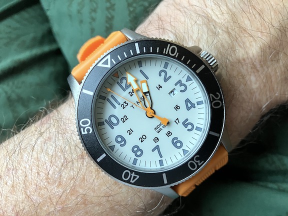
Then there is a group of silicone strap styles that appear in 2018. These are the examples, to me, that are real cross-overs. Most have the field dial, with a diver strap and one color bezel insert. The standout diver is the TW2T30000. It has the circle/bar/triangle hour marker dial of a diver as well as a color highlight on the bezel for the first 15min count range. It is a style that will be reintroduced again. The off-white-dialed TW2R67400 has a very diver-ish feel even though it has the field-style dial layout. I think this one was popular? It is the only white-ish dial of the line. You can’t hide with that orange strap! my example is dated 2023. Even so, they have not been easy to find.

Another two in the silicone rubber group are these green and blue styles that have a strong field watch aesthetic with the overall monochrome color scheme. At the same time they exhibit that cross-over identity of the Allied Coastline; the bezel and the rubber strap — even the hands trigger diver comparisons.
These rubber straps deserve some more discussion here, too. Timex treats straps as an integral part of the total design. Each style number usually has a unique strap. These rubber straps feel solid, and have a distinctive look. It is a modern, tool-ish look rather than vintage. It is 20mm wide with no taper. I’m not sure the polymer used, but being it is Timex, it is a cost-saving mixture. Called “silicone” in marketing materials, it is somewhat stiff with a slight plastic feel rather than soft feel, but still flexible. They also incorporate a keeper lock feature that stops the single keeper from sliding off the end. It is a fun and effective feature. This strap was also used on some 40mm Allied styles. As interesting as it is, I would prefer another warmer, softer material for everyday wear? If I wore these watches more, I could see this strap being used in wet or muddy experiences, then switched out for a dry home/office routine.

Next up we have two ACs that want nothing to do with the field watch look. Maybe they should be called Allied Surf? If you didn’t know otherwise, you might think these two were a completely different watch than the two above? So, after all, Timex did have some 100m diver-style (swimmers?) lurking among all those Archive field/military flavored watches. When I first saw these, I was not interested in the more modern style. Now they rank as two of my favorite ACs. They are a little hard to find at this point. These might have been a European release only?

To me, these are not typical Archive era vintage military style. Instead this is a modern take on a diver with some iconic vintage inspired hands. They are a departure from anything I know of in the Allied, Navi or other contemporary lines? I don’t know of any other Timex that uses this hand set? It is similar to the hands on the Allied LT and later Standard lines, but still different — more modern. I think these appeared in 2019?

The sector dials, dark shades, cordura-like straps, just set them apart. The TW2U10600 is the first of two black PVD models in the AC line. Even though they seem so different, the cast brass, plated case, crown and 60-click bezel are the same as all 43mm ACs. The bezel inserts are similar to the black/red TW2T30000 above, but the hands really change things up. There is no lume on the hour markers. I haven’t seen this woven strap with a leather underside on any other timex. These stock photos are dark and make the silver/orange version look like a gunmetal. On the Blue one, some of those black colors are actually a dark grey. The Silver one is not the standard silver blasted finish used on this line and many Allied watches. It looks more shiny, like a dipped finish. Not blasted or brushed? I similar sheen is seen on other Allied watches, but usually in. a darker color.

Last Edition
As I mentioned earlier, most ACs were made between 2017 and 2020, but then years later there comes this 2022-23 release. It seems to me the diver influence came later and then became the dominant style. Originally the AC was a field watch with a diver-like bezel and 100m WR. At some point, it seems Timex leaned into a straight up diver look? I could have put the TW2T30000 with the last group because of the dial and bezel design, but it did not have the improved lume or fabric strap of the 2023 version.

Yes, this TW2T30300 is almost the same watch as TW2T30000 above, but it has different strap and improved lume. This is the only instance of this in the line where the color scheme was repeated, but is something Timex has done with other Archive lines. When the same watch gets another strap, it picks up anew model number. Timex has done this in the past to move leftover stock; give it a different look with a new strap, maybe for a different market. In this case there is actually an different (improved) dial.
So what do we have with this group? Three diver-style dials/bezels and a new cool woven NATO style strap. But look: the skeleton hands are back?! Why did Timex decide to drop the cool arrow/dauphine set?! The woven straps are unique and feel really nice? These are the last versions and are what you can mostly find for sale online in late 2024 at the time of this writing. The earlier 2017-2020 styles are harder to find.
When I look at these last three, I like all the colorways and the straps. I also see a shift from field to dive? These are also classic dive watch color schemes. The black is there for the modern stealth/military feel. Timex must have sensed a trend away from military /field to the diver in the watch enthusiast realm? These diver-style versions of the AC have more lume, too. The earlier field style dials do not have lume on the dial. Only the hour and minute hands have lume. On the divers, the hands, even second lollipop as well as hour markers have lume. The orange dialed TW2T30200 that I own, has the strongest lume on the hour markers. It is from the latest set. Its dial is made differently from those on the earlier TW2T30000. The hours markers are without the shiny silver borders and have more lume material. From looking at online images only of the Blk/Red TW2T30300 and Blue/Orange TW2T30400, it looks like they also have the extra lume?


Maybe it doesn’t show in these images, but the dial lume on the later models is brighter and lasts longer. Anyway, I don’t expect or really need lume performance from watches like these. I just think it interesting that Timex decided to improve the lume on the last ACs even though they have the Indiglo.
Final thoughts
I really think, now, that the Allied Coastline was a crossover line from field watch to diver. In the bigger picture these signaled the move away from vintage military. I wonder why the designers decided to put a bezel on a field watch? The Navi line in 38mm and 41mm did the same thing. I also think the line is an underrated group of watches. I think its popularity was affected by the fallout of the Covid pandemic. Several reviews I have seen over the years the line was available had a similar tone. The reviewers mentioned the presence of both field watch and dive watch design cues and some bewilderment. Later they referred to them as divers. There was also the frequent expression of surprise of discovering an unknown watch and delight with the straps and designs. “Cool” was a descriptive used often. Then as usually the case with all things Timex, the reviewer says something that includes “but, only, cheap, sale, beater, or …for the cost, because Timex has to be put in its place, outside of serious watches.

I do the same thing. That is the allure of Timex. Nobody does it like Timex. Their watches always seem to be more than they are. They stylistically punch above their spec weight. Can I say that? We like them so much we want them to be more than they are. They do style, fashion and fantasy so much better than many “real” watch brands, which use high quality materials with nice movements and finishing, but can still turn out boring watches.
What intrigues me most about the ACs is the diver aspect. I have been thinking about the history of Timex and diver or dive-style watches and the problem they have with the price/spec balance. They really can’t compete in the tool watch space. They occupy their own space on the border between fashion and tool. Just enough specs to go swimming but not enough specs to last long or be repaired for long. They live within a strict price point. Really most are still throw-away watches, fast fashion, because Timex is not able to maintain the logistics and repair of so many styles over time. With some of these ACs Timex quietly slipped in some modern diver styling.

The Waterbury Dive 41mm of 2022 with its compressor like double crown and inside scale used the Allied Coastline hands. I guess this is the closest successor to the AC but it has a whole different character? It is interesting, but a version with a normal bezel might have been a good option? Another improvement would be using the hands from the TW2U10700VQ above. That Waterbury-W second sweep is a bit much, too. I think there is potential here but there is something discordant about the collection of design elements? I can’t decide if its retro or modern? Why Waterbury?
Recently Timex released actual 200m tool divers in the form of Deepwater Reef. But at $200 to $450+ they have lost the design details that these ACs had for $100. The Reef almost feel like rough prototypes in comparison. Maybe that is the difference between fashion and tool? The AC really has no link to the Reef but I think it may have influenced the Reef some; the Reef hands, in a way, are an updated version of the AC skeleton hands.
I would like the ACs more if they were 40-41mm with lugs a bit shorter. I like the variety of colors, straps and styles. The hand set is very distinctive. I like that they have a 20mm rather than 22mm strap. I think there is some potential here for a swimmer model for Timex to continue? Something between their clunky Expedition North efforts and the Deepwater? Something with a little more tool than the Standard and Waterbury lines? Some of the fun is missing since the end of the MK1s, Allied and Navi Archive lines.

Leave a Reply